Start from the style of your house
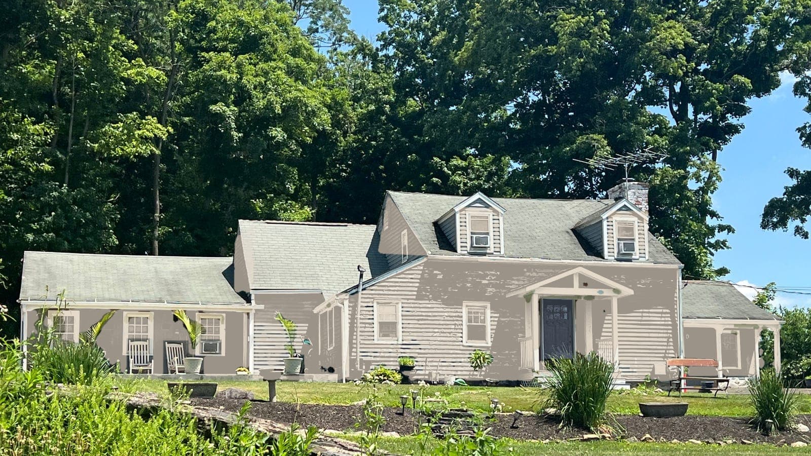
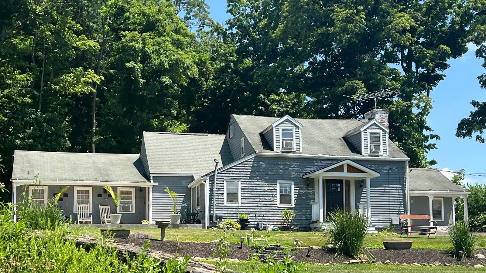
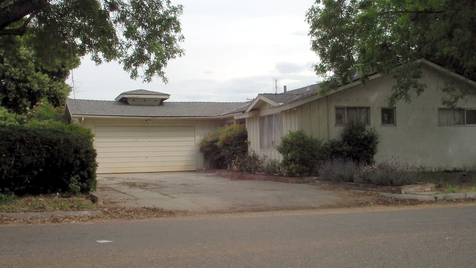
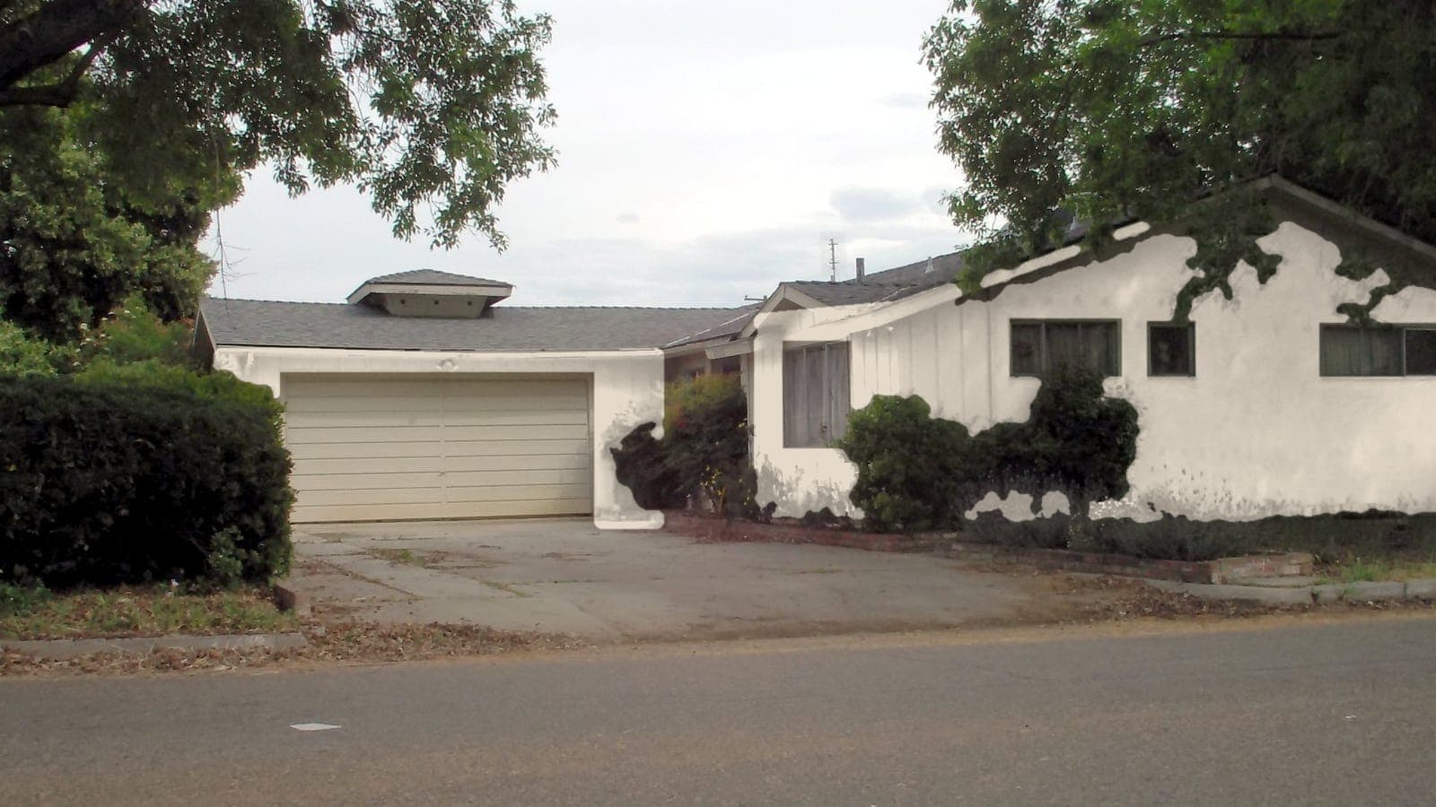
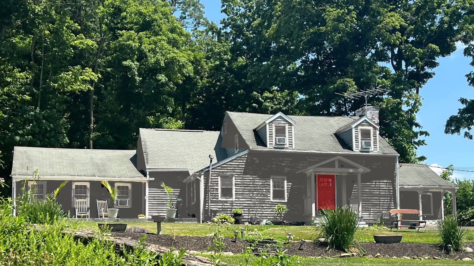
The architecture narrows the field before you ever open a fan deck. Ranches usually look best in calm, low-contrast colors that keep them grounded: greige, soft gray-greens, warm whites. Colonials and Cape Cods carry classic contrast well: white or cream trim with navy, charcoal or deep green siding, and a front door that stands out. Farmhouses lean on white siding with black accents, or the reverse. Craftsman bungalows like earthy body colors with a contrasting trim that shows off the brackets and columns.
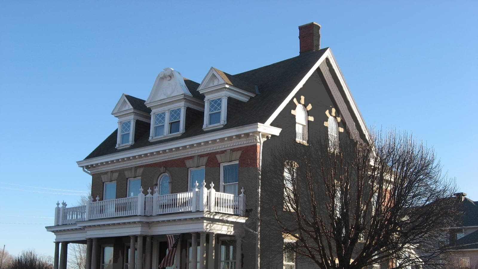
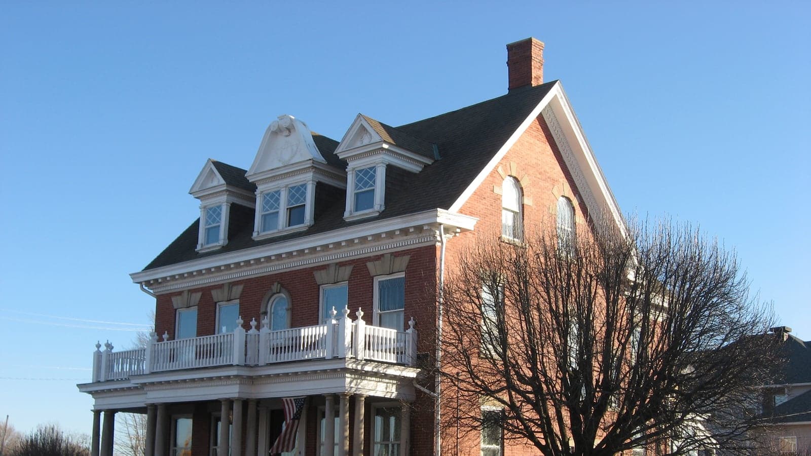
Brick houses are their own case. Many owners keep the brick and change trim and door; others paint or limewash the brick for a cleaner look. Try both on your photo before anyone touches a brush, because painted brick is hard to undo.
Undertones decide whether a color works
Two grays with the same lightness can look completely different on a house. One leans green, one leans blue, one leans warm beige. Next to a red brick chimney or a brown roof, a cool gray can look cold and a warm gray can look muddy. The only reliable way to check is to see the color next to the fixed parts of your house: the roof, the stone, the brick, the windows.
Light and dark also behave differently outdoors. Exterior colors look lighter and brighter in full sun than on a chip, so many people end up choosing one step darker than their first pick. Very dark colors on large walls look almost black from the street.
Copy the code, then sample it
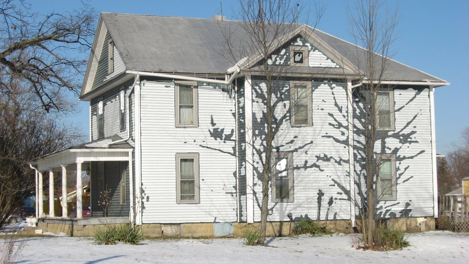
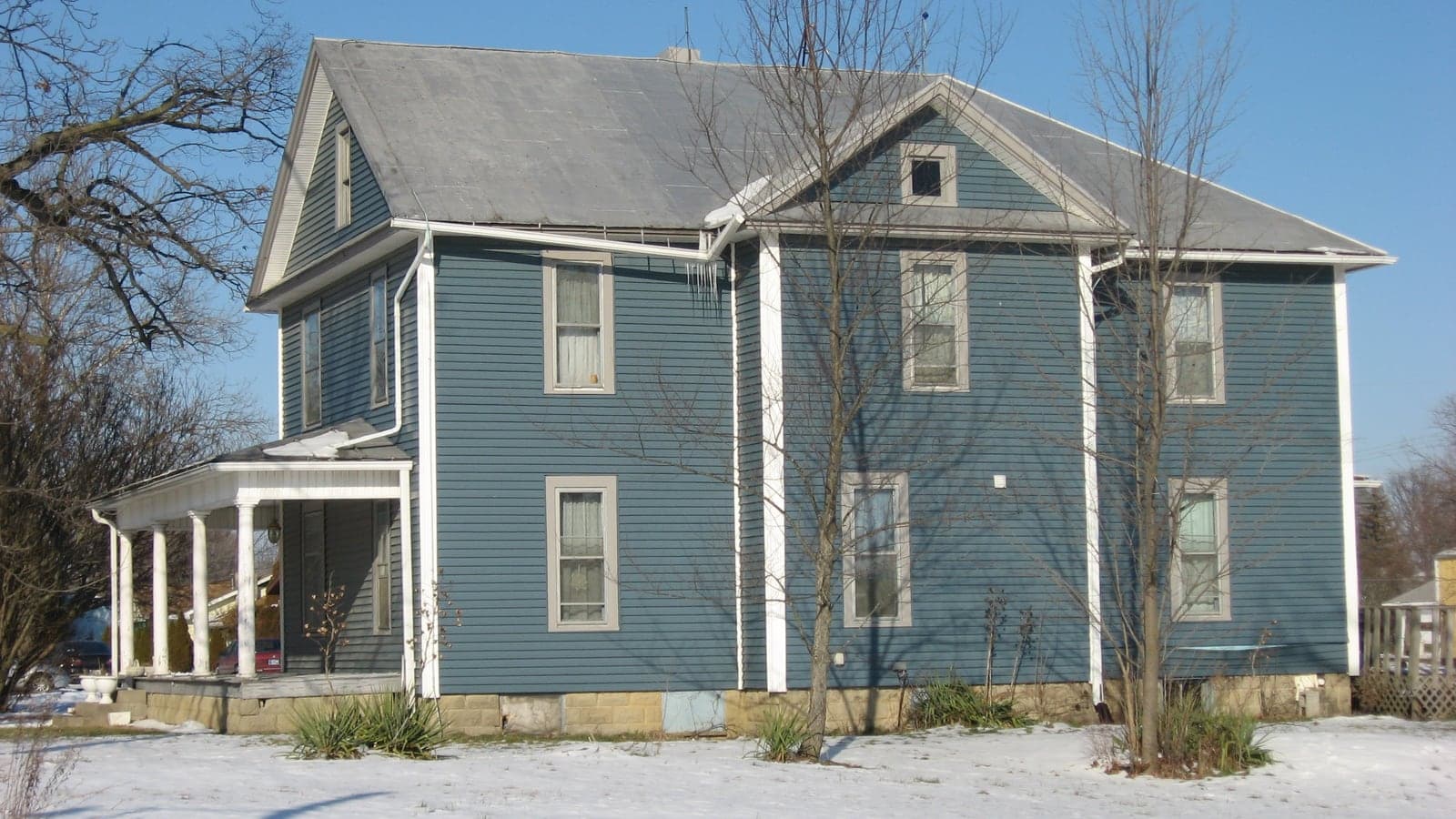
Every color in the result is listed with its brand, name and code, like Naval SW 6244 or Hale Navy HC-154, and a Copy button. Take the code to any store that carries the brand. Then buy a sample and paint a large piece of poster board, at least two feet square, and look at it against the house at different times of day. Screens are an approximation; the sample is the truth.